Case study · education finance
Auxilo
As Principal Designer, I created the UX foundation for three distinct Auxilo products: an education loan engine, a scholarship platform, and a mentorship network for students studying abroad. This was NDA-protected client work delivered via a product partner.
- Role
- Principal Designer
- Domain
- Education finance
- Surface
- Three new products
- Year
- 2024–2025
01 · The brief
Auxilo needed a unified UX for three very different new products. The challenge was making a high-stakes loan application, a scholarship tool, and a guidance platform all feel like a single, cohesive brand.
02 · Three products, one foundation
To avoid a disjointed user experience, I designed a shared foundation first. By using unified components and language, a student using multiple Auxilo services feels supported by one connected system during a highly stressful time in their life.
A financial application people can actually finish.
Pool funds by need, score applicants, disburse via committee.
An AI education advisor, plus real 1:1 mentors.
03 · The loan engine: making a scary application finishable
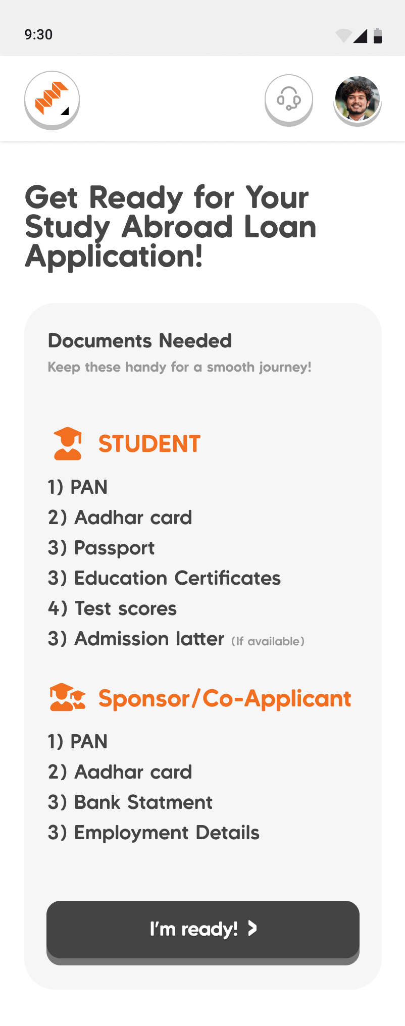
Education loans are daunting, so we designed the fear out of the flow using three main strategies:
- Upfront expectations: A clear checklist shows exactly what documents the student and co-applicant need before starting, preventing mid-form surprises.
- Manageable steps: The form is broken into named steps to avoid an overwhelming, endless scroll.
- Invisible complexity: We streamlined heavy compliance tasks (like KYC and co-applicant flows) into a calm, guided journey on both web and mobile.
04 · Confidence, at the moment of doubt
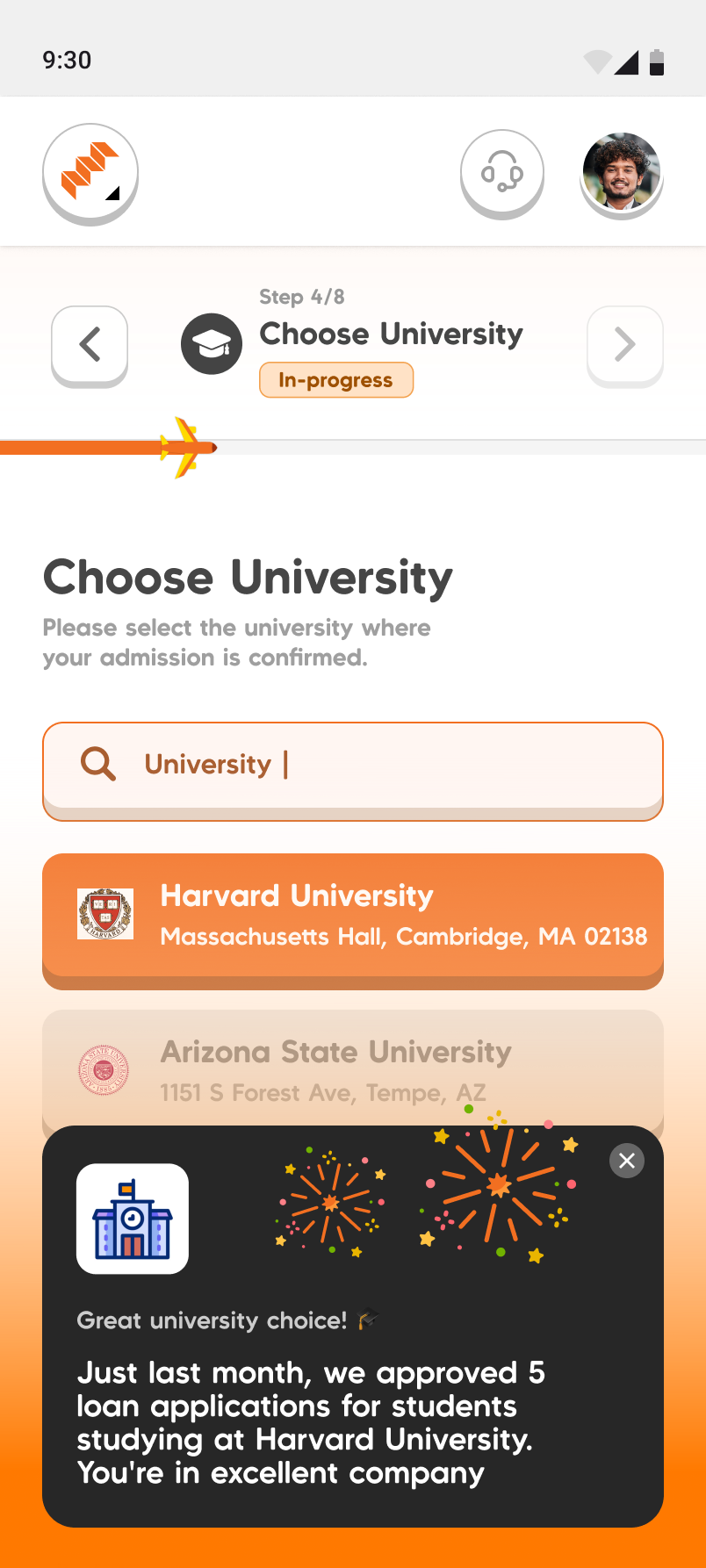
To ease anxiety, the interface provides contextual reassurance. For example, selecting a university triggers a nudge showing recent loan approvals for that specific school, offering social proof exactly when users might second-guess themselves.
05 · ImpactX: giving money away, fairly
This platform solves the problem of distributing limited scholarship funds transparently.
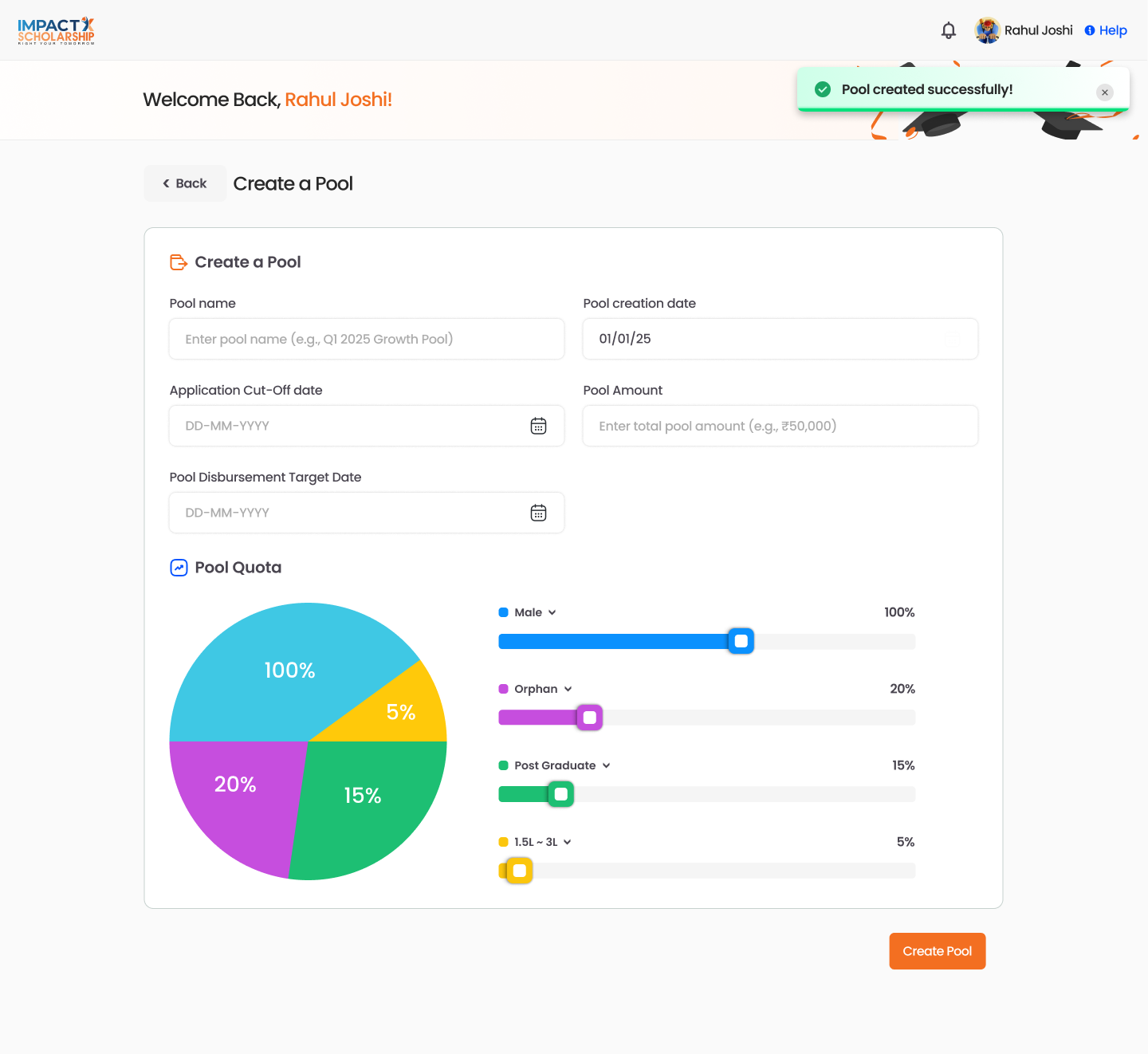
- Built-in fairness: Administrators set funding pools and quotas based on need before anyone applies.
- Transparent leaderboards: Applicants get a clear score and can see their exact rank and expected amount instead of waiting in the dark.
- Human verification: The system pairs algorithmic scoring with human review (like home visits) to ensure fairness beyond just numbers.
A transparent score, and a leaderboard.Every applicant gets an ImpactX Score, and a student leaderboard ranks them by it, each row showing the applicant's situation (for example “orphan, with institute”), their score, and their scholarship amount. A student can see where they actually stand instead of waiting in the dark.
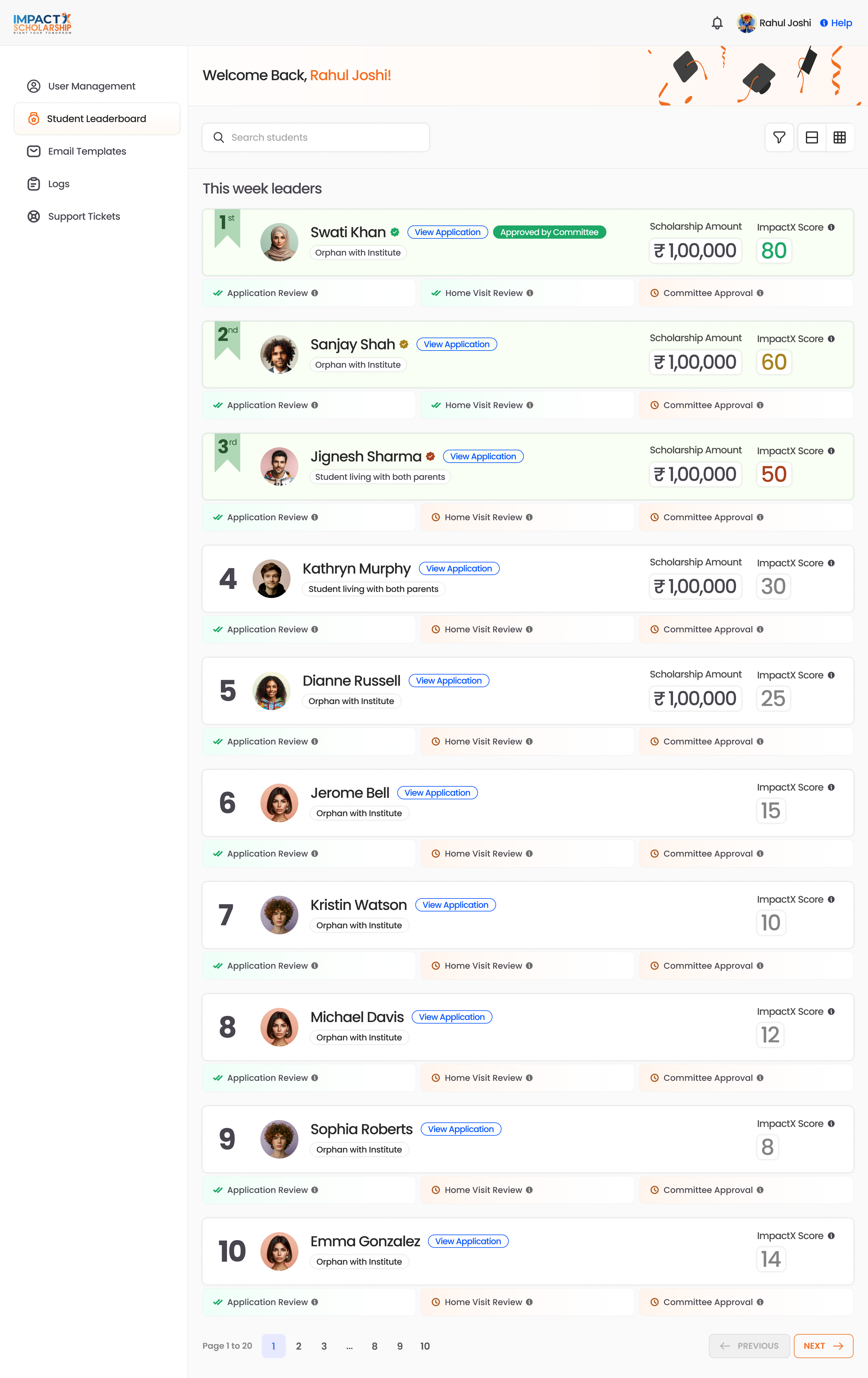
Judgment where a number is not enough. A score cannot see a home. So the review pipeline pairs the ranking with human verification: application review → home visit → committee approval.The design keeps the score and the people in one legible pipeline, so a committee's decision is informed by the number but never replaced by it. Three roles run through the product, student, administrator, and approval committee, and the craft was keeping one system clear to all three.
06 · The student network: guidance, human and machine
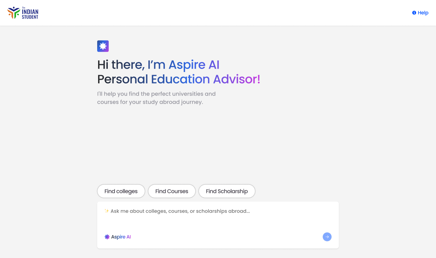
This platform offers support through both AI and human mentorship for students planning to study abroad.
- Aspire AI: Instead of an intimidating blank chat, an AI advisor uses structured choices to guide students to relevant courses and colleges.
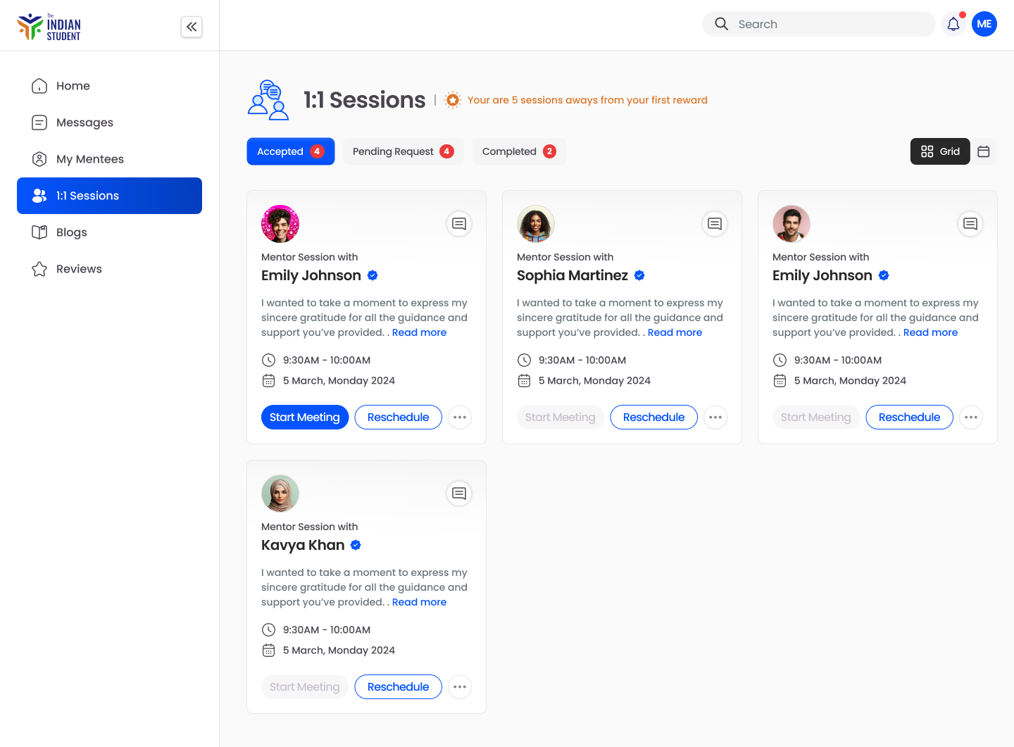
- 1:1 Mentors: Students can easily book sessions with real mentors who have successfully studied abroad, ensuring they never feel alone in the process.
Real mentors, one to one. Alongside the AI, students book 1:1 sessions with mentors, message them, and leave reviews, while mentors run their own sessions and events. The machine narrows the field; a human who has already done it walks you the rest of the way. Across both, the intent was the same: a student far from home should never feel like they are figuring this out alone.
07 · Holding it together
Establishing a shared design system allowed a small team to build three apps in parallel. This foundational consistency kept development moving quickly without fracturing the brand's identity.
08 · Reflection
The project successfully balanced three distinct, high-stakes products under one unified experience. Working through a partner also provided valuable discipline in designing within an external team's existing delivery structure.