Product designer, nine years, who also builds the thing.
I lead the design — research, UX, interfaces, systems — and then build the front-end and wire up the AI myself. I have run an independent studio since 2018. I now want to point that energy at one team.
ConvenioLead DesignerA tablet point-of-sale app designed from scratch for a planned retail product: a checkout built for momentum, plus the product setup, discounts, reporting, and receipt trail behind it.Case study
BanqinLead DesignerA white-label mobile banking app designed from scratch for smaller and rural banks across East and Southeast Asia: transfers, security, accounts, and lending in one visual language.Case study
AuxiloPrincipal Designer · 2024–2025Principal designer for three new products at an education-finance company: a loan-application engine, a scholarship platform, and a community for students abroad, on one design foundation.Case study
No-code ML platformProduct designer · 2022–2023Embedded designer for fourteen months on a no-code AI platform: around 190 screens laying out connect, transform, train, explain and predict as a path an IT generalist can walk.Case study
Wadhwani FoundationDesign Lead · 2021–2024Learning platform serving 6M+ learners and 5,000+ startups across India.
Insurance regulatorDesign lead · 2021–2022Led design of the citizen-facing website for India’s national insurance regulator, delivered through ValueMomentum: 200K monthly users, WCAG 2.1 AA, English plus 12 languages.Case study
Products built
RippleAIProduct designer · 2025–presentFree public AI chat, designed and built solo. Streaming and thinking states, sourced web answers, vision input, and image generation on one thread.Case studyai.rippledesign.co
Signal FireDesign + build · 2025A lead-discovery tool I designed and built for my own studio. It resolves messy public data into single businesses, ranks them by independent signals, and drafts outreach a human reviews before sending.Case study
JobOpsProduct designer + engineer · 2026A job-search operating system built with Claude Code: ~19 scraper integrations, an eligibility gate encoded as data, a rubric scorer, and a drafter that writes within guardrails. No auto-submit — every application is reviewed by a human first.Case study
RippleMeetDesigner + engineer · 2025Browser-based video meetings with recording and post-meeting transcripts, built solo.meet.rippledesign.co
A tablet point-of-sale application designed from scratch for BetterCommerce's planned retail product offering.
Client work for BetterCommerce · NDA expired
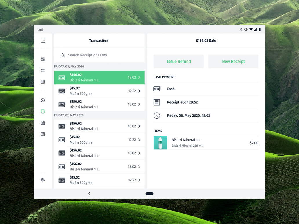
A transactional workspace that keeps the day’s sales and receipt details side by side.
Role
Lead Designer
Domain
Retail operations
Surface
Tablet application
Year
Not disclosed
A new retail point of sale
BetterCommerce engaged us to design a new tablet POS application from the ground up as part of its planned retail offering. I led the design alongside a junior designer, shaping the product around the day-to-day work of a store: finding items, completing sales, and keeping the operation organized after checkout.
The product’s focus: retail inventory and sales management.
A counter built for momentum
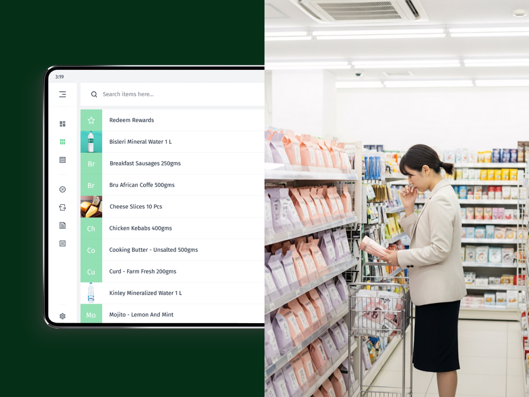
The checkout surface keeps the current basket, product search, and charge action in view at once. On a busy shop floor, that gives an operator a direct path from finding an item to completing a sale.
Products arranged for quick finding and adding at the counter.
The work behind the counter
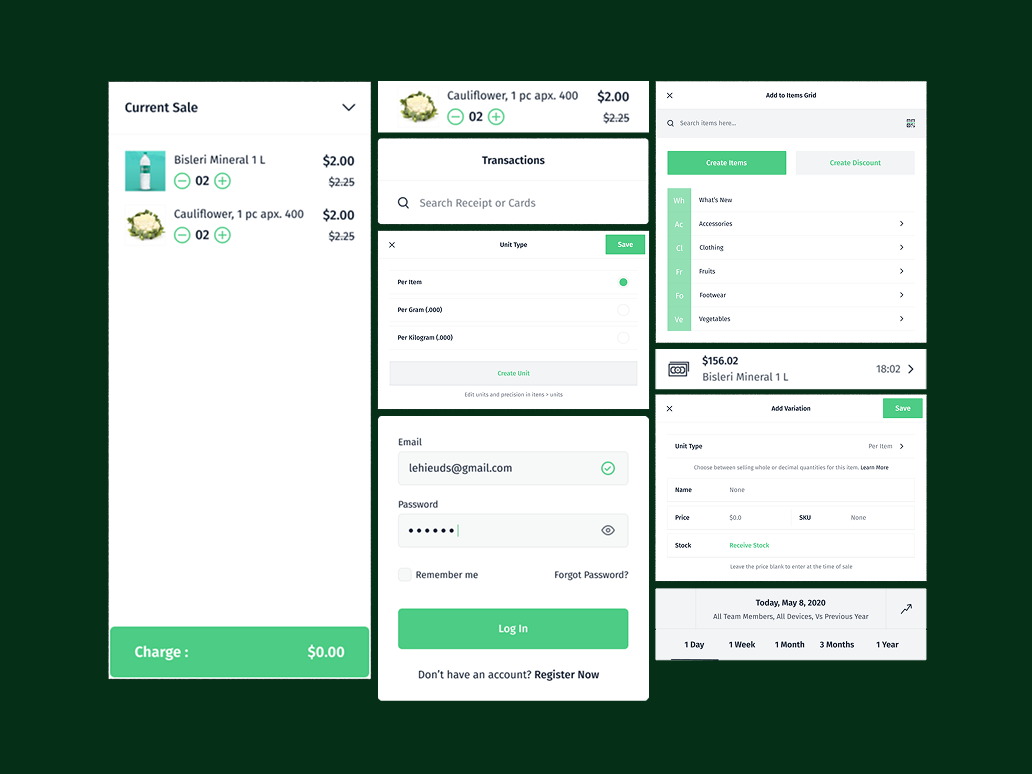
A sale depends on more than the checkout itself. The wider system covers product setup, units, discounts, variations, team access, and reporting—giving a retailer the operational context that keeps the POS useful day after day.
The surrounding system: products, units, variations, reports, and point of sale.
A clear trail after checkout
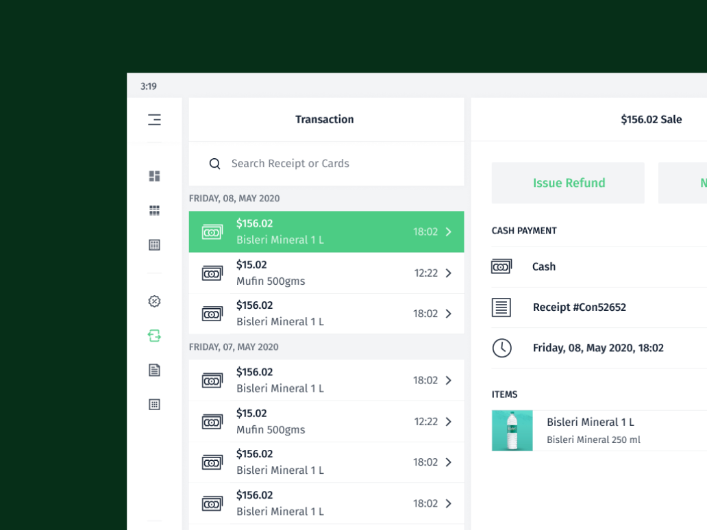
Transaction history keeps a past sale easy to retrieve and understand. An operator can search receipts, inspect payment and item details, and take follow-up action from the same place.
A receipt trail that makes a past sale easy to find, understand, and act on.
White-labelled banking application
Case study · mobile banking · East & Southeast Asia
A mobile banking application designed from scratch for Bank Genie, giving smaller and rural banks across East and Southeast Asia a foundation they could make their own.
Client work for Bank Genie · NDA expired
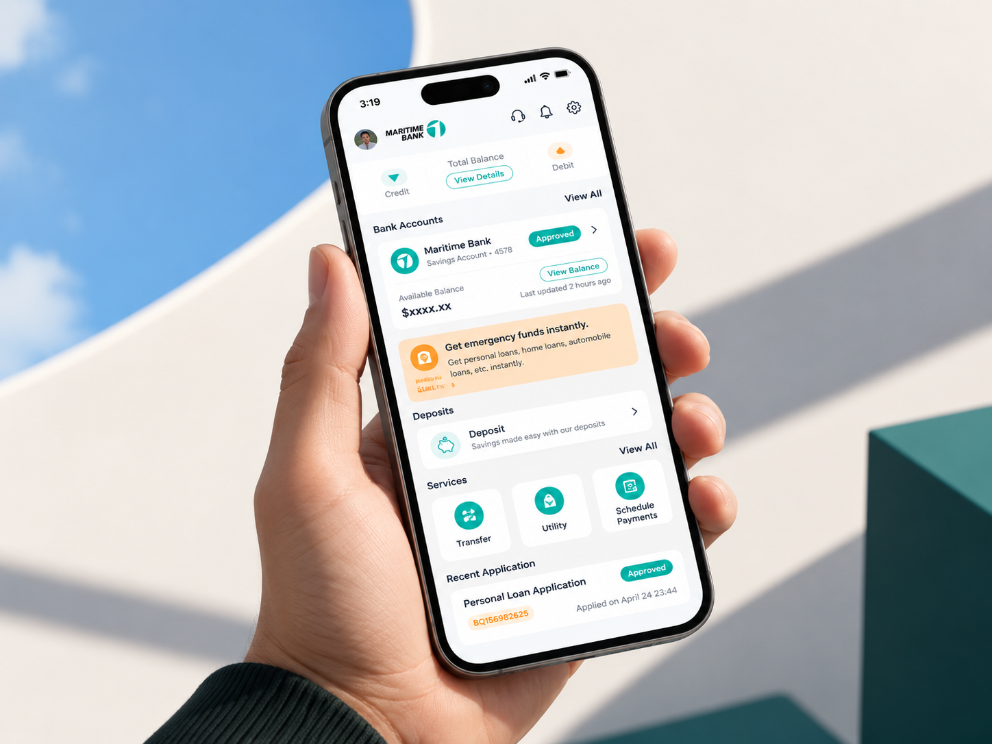
A calm home for the whole banking relationship: accounts, helpful services, and the next relevant action.
Role
Lead Designer
Domain
White-label banking
Surface
Mobile app
Year
Not disclosed
Banking infrastructure for local institutions
Smaller and rural banks across East and Southeast Asia need modern digital services without building a complete product team from scratch. Bank Genie commissioned a white-label mobile application that could give those institutions a credible, approachable banking experience under their own brand.
A foundation, not a one-market app
I led the design from the ground up alongside a junior designer. The work needed to support different banking brands and local contexts, including Thai and Vietnamese versions, while keeping the core experience coherent across markets.
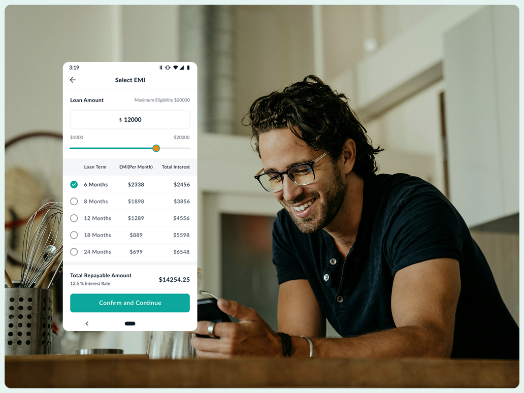
Loan options, presented as a decision rather than a black box.
Everyday banking, made easy to scan
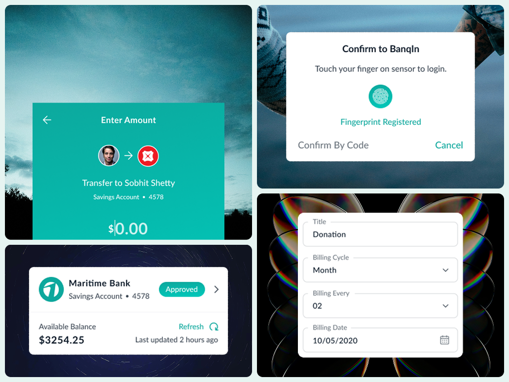
The mobile experience brings the most common banking moments into a single, consistent language: checking an account, sending money, confirming identity, and exploring a loan. The screens keep the next action close to the information that supports it.
A focused transfer flow.A clear, recognizable security confirmation.
One product, many banking moments
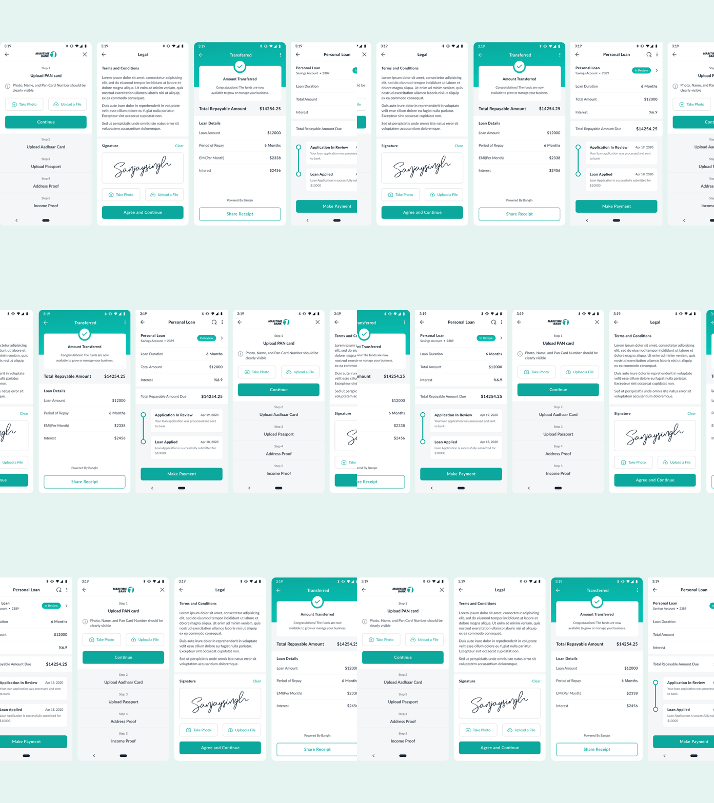
The system extended beyond the account home into transfers, security confirmation, account management, scheduled payments, and lending. Together, these surfaces show how a flexible product foundation can serve a bank's complete customer relationship.
One visual language across transfer, security, account, and scheduled-payment moments.
Auxilo
Case study · education finance
As Principal Designer, I created the UX foundation for three distinct Auxilo products: an education loan engine, a scholarship platform, and a mentorship network for students studying abroad. This was NDA-protected client work delivered via a product partner.
Role
Principal Designer
Domain
Education finance
Surface
Three new products
Year
2024–2025
The brief
Auxilo needed a unified UX for three very different new products. The challenge was making a high-stakes loan application, a scholarship tool, and a guidance platform all feel like a single, cohesive brand.
Three products, one foundation
To avoid a disjointed user experience, I designed a shared foundation first. By using unified components and language, a student using multiple Auxilo services feels supported by one connected system during a highly stressful time in their life.
Loan engineApply for an education loan
A financial application people can actually finish.
ImpactXGive scholarships fairly
Pool funds by need, score applicants, disburse via committee.
TIS networkGuidance to study abroad
An AI education advisor, plus real 1:1 mentors.
The loan engine: making a scary application finishable
Education loans are daunting, so we designed the fear out of the flow using three main strategies:
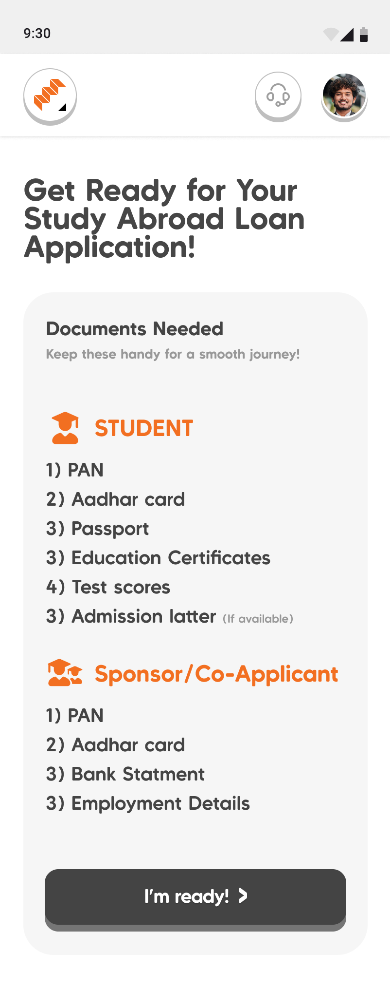
Upfront expectations: A clear checklist shows exactly what documents the student and co-applicant need before starting, preventing mid-form surprises.
Manageable steps: The form is broken into named steps to avoid an overwhelming, endless scroll.
Invisible complexity: We streamlined heavy compliance tasks (like KYC and co-applicant flows) into a calm, guided journey on both web and mobile.
Expectations set before the form: what the student needs, and what the sponsor needs, up front.
Confidence, at the moment of doubt
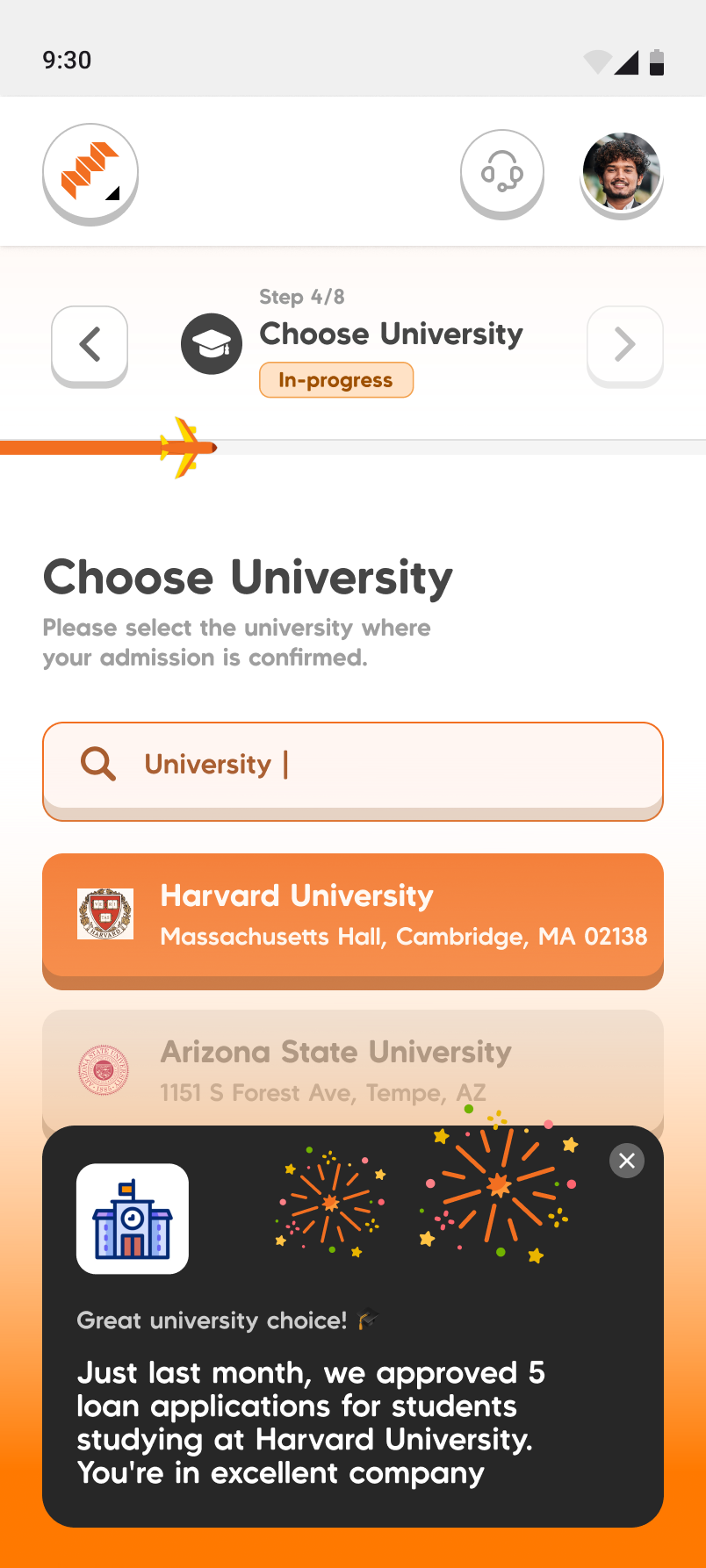
To ease anxiety, the interface provides contextual reassurance. For example, selecting a university triggers a nudge showing recent loan approvals for that specific school, offering social proof exactly when users might second-guess themselves.
Step 4 of 8. Pick your university, and a nudge fires: 'Great university choice! Just last month, we approved 5 loan applications for students studying at Harvard University.'
ImpactX: giving money away, fairly
This platform solves the problem of distributing limited scholarship funds transparently.
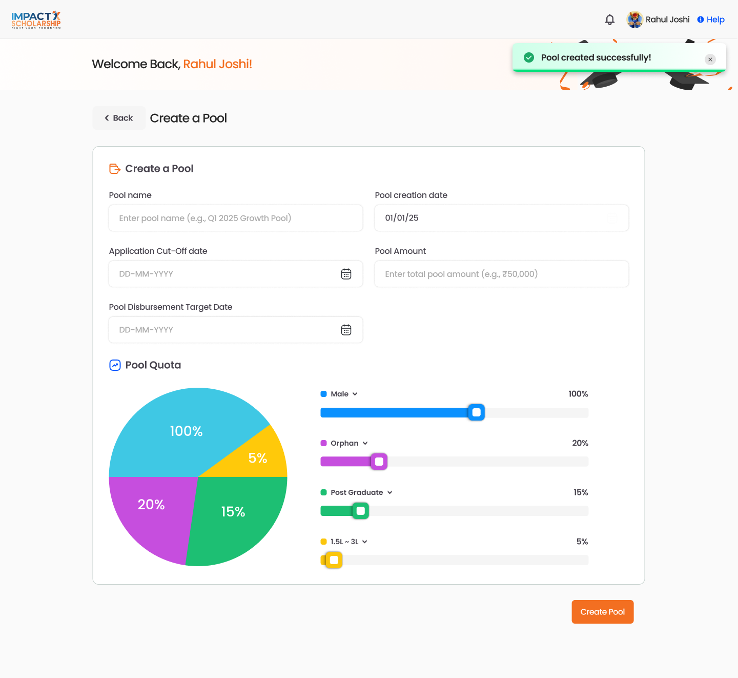
Built-in fairness: Administrators set funding pools and quotas based on need before anyone applies.
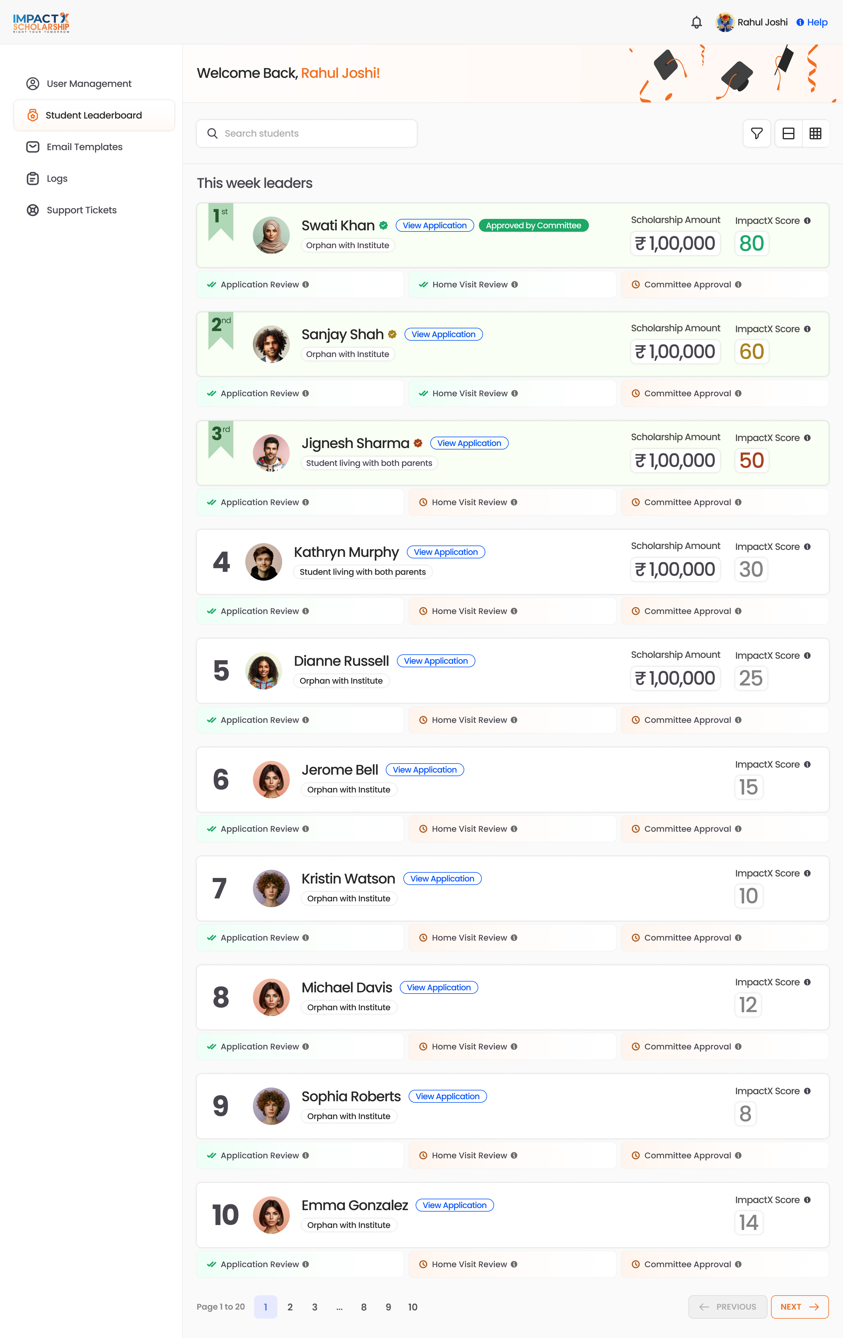
Transparent leaderboards: Applicants get a clear score and can see their exact rank and expected amount instead of waiting in the dark.
Human verification: The system pairs algorithmic scoring with human review (like home visits) to ensure fairness beyond just numbers.
Creating a funding pool: an amount, dates, and a quota split across need categories, so fairness is set before anyone applies.
A transparent score, and a leaderboard. Every applicant gets an ImpactX Score, and a student leaderboard ranks them by it, each row showing the applicant's situation (for example “orphan, with institute”), their score, and their scholarship amount. A student can see where they actually stand instead of waiting in the dark.
The leaderboard: applicants ranked by ImpactX Score, each showing their situation, scholarship amount, and where they are in the application → home visit → committee pipeline.
Judgment where a number is not enough. A score cannot see a home. So the review pipeline pairs the ranking with human verification: application review → home visit → committee approval. The design keeps the score and the people in one legible pipeline, so a committee's decision is informed by the number but never replaced by it. Three roles run through the product, student, administrator, and approval committee, and the craft was keeping one system clear to all three.
The student network: guidance, human and machine
This platform offers support through both AI and human mentorship for students planning to study abroad.
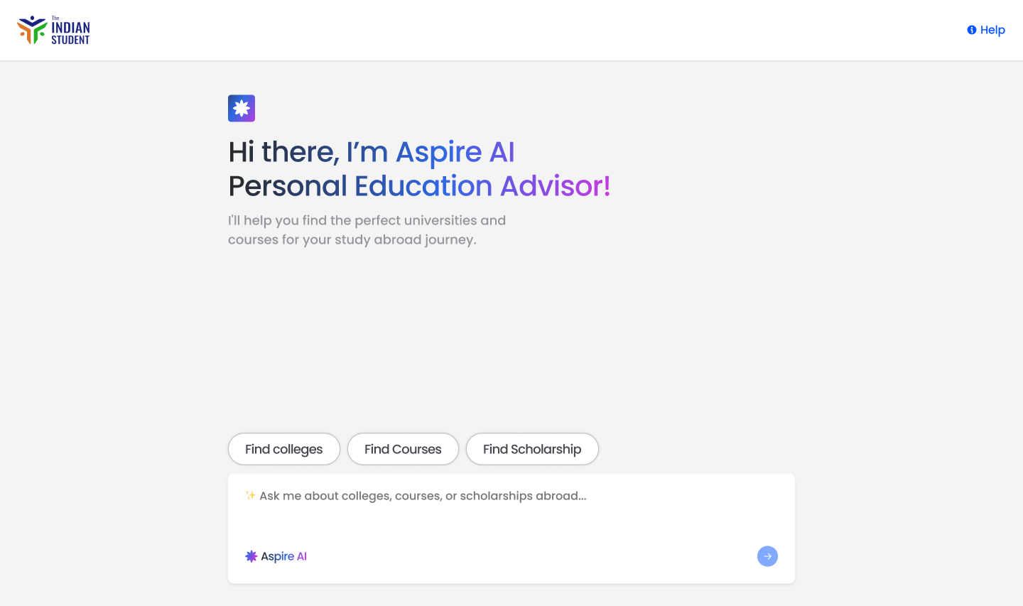
Aspire AI: Instead of an intimidating blank chat, an AI advisor uses structured choices to guide students to relevant courses and colleges.
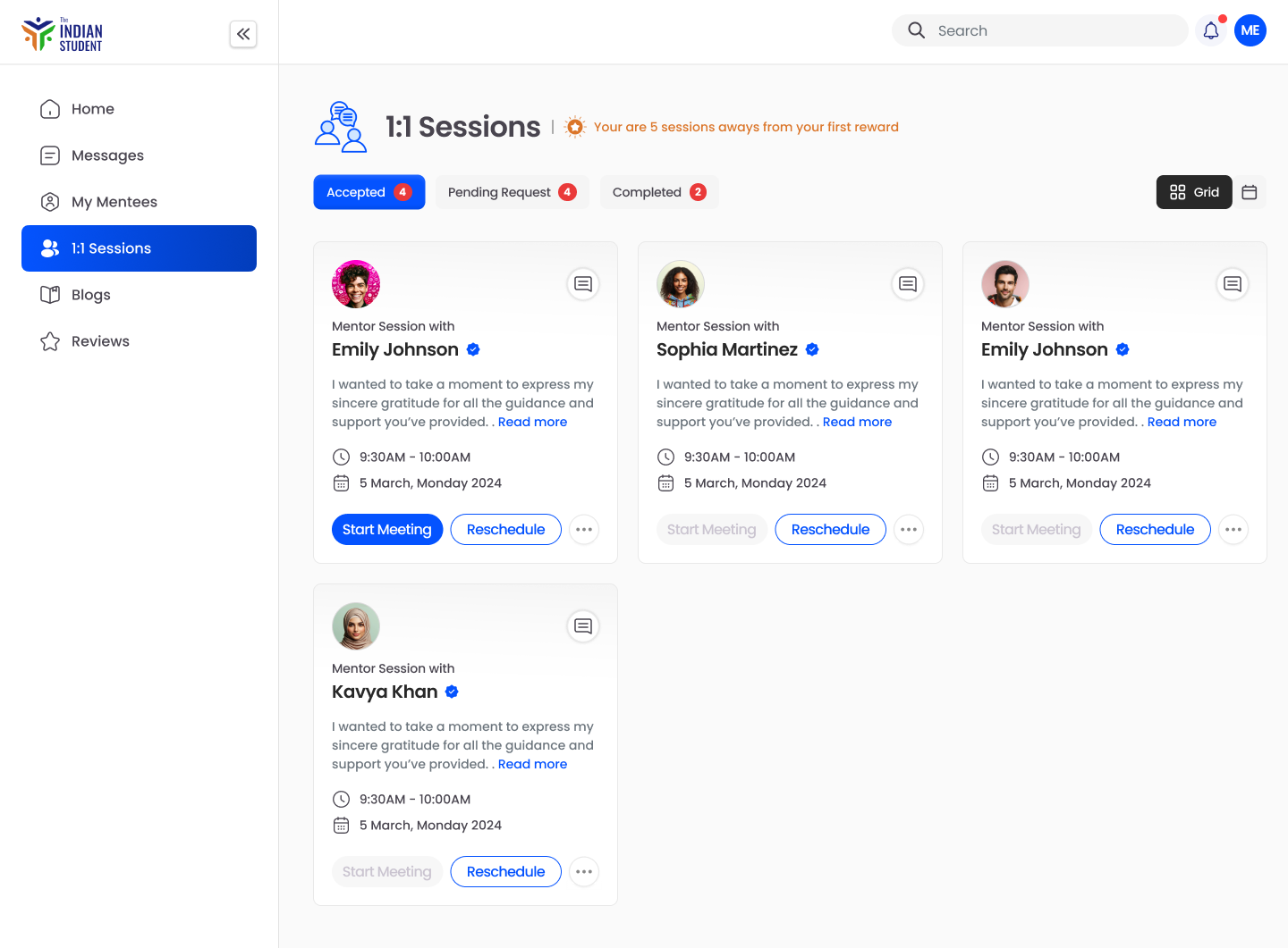
1:1 Mentors: Students can easily book sessions with real mentors who have successfully studied abroad, ensuring they never feel alone in the process.
Aspire AI opens with guided quick-actions (find colleges, courses, scholarships) instead of an empty prompt.
Real mentors, one to one. Alongside the AI, students book 1:1 sessions with mentors, message them, and leave reviews, while mentors run their own sessions and events. The machine narrows the field; a human who has already done it walks you the rest of the way. Across both, the intent was the same: a student far from home should never feel like they are figuring this out alone.
The human half: students book and manage 1:1 sessions with mentors, with a light nudge toward the next one.
Holding it together
Establishing a shared design system allowed a small team to build three apps in parallel. This foundational consistency kept development moving quickly without fracturing the brand's identity.
Reflection
The project successfully balanced three distinct, high-stakes products under one unified experience. Working through a partner also provided valuable discipline in designing within an external team's existing delivery structure.
A no-code machine learning platform
Case study · machine learning · B2B SaaS
Fourteen months as the embedded product designer on a platform that lets IT teams build, train and deploy machine learning models without writing code, and without needing a data scientist in the room.
Client work · details anonymised
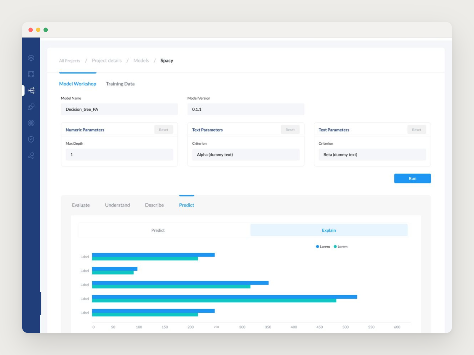
The model workshop: parameters you can tune, and an Explain view that ranks what drives the result.
Role
Product designer
Domain
Machine learning
Surface
Web application
Year
2022–2023
No-code does not delete the pipeline
Machine learning has a real workflow underneath it: connect a source, ingest a dataset, clean and transform it, choose features, tune training, train, evaluate, explain, predict, deploy. None of those steps can be removed. A no-code product does not get to skip the pipeline. It only gets to change who can walk it.
So the job was not simplification in the cosmetic sense. It was sequencing: taking a workflow a data scientist holds in their head and laying it out as a path an IT generalist could follow without knowing in advance what they were about to need.
Designed against the build, every month
I worked embedded with the founding team as the only designer. The founders shared wireframes and intent; I turned them into Figma flows rather than single frames, and short calls several times a week each settled one thing. Developers and testers fed back on feasibility, and screens changed because of it.
Over fourteen months that came to around 190 screens, and every one of them had to survive contact with what the team could actually ship that month. That rhythm is why the product reads as one system rather than a deck of ideas.
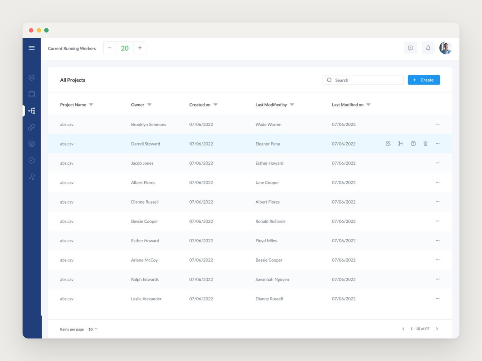
Projects as the front door: who owns what, and what changed last.
The wizard is the product
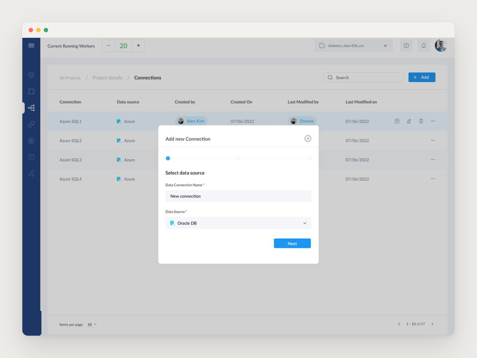
Data comes in through connections, treated as first-class objects: a list of what is wired up, and a stepped wizard for adding a new one, so a user picks a source, authenticates and names it without ever seeing a connection string.
Almost every irreversible step in the product is wrapped in the same kind of stepped modal with a visible progress rail. The repetition was deliberate. Once someone has learned one wizard, they have learned all of them, which is what makes it possible to add a complicated step later without retraining anyone.
Adding a data source: three steps, one decision per step.
Never hide the data
Transformation is a visual pipeline where components are chained and the output of each is inspectable. This is the screen that decides whether a no-code product is honest. If the pipeline is a black box, nobody trusts the model at the end of it, so raw data stays viewable at every stage.
Training follows the same principle. Pre-processing, sampling, validation split and seed sit in a panel rather than behind defaults. The no-code promise is that you do not have to touch them, not that you cannot.
Explain sits next to Predict
A trained model opens into a workspace where explaining a result sits at the same level as producing one. Feature importance is a ranked bar chart, so a business user can say which inputs drive the output, and a prediction can be run against new inputs right there.
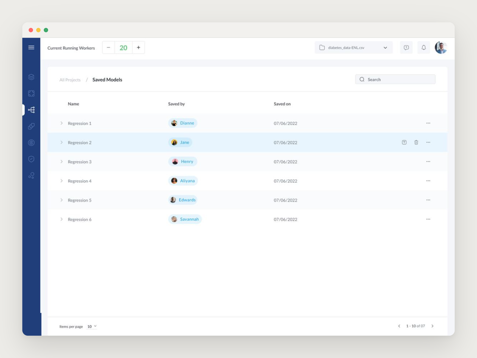
Putting the two side by side states a position: a prediction you cannot account for is not finished. Saved models sit in a versioned list, so you can see who saved what and compare runs over time.
Saved models, versioned and attributed, so runs can be compared.
Designed for the reviewer, not the demo
The client reviewed real screenshots and sent back numbered, hand-annotated notes, so screens were laid out to make a marked-up image a workable review artefact. Feedback from their customers was positive.
The engagement began as a two-week trial and became fourteen months, expanding from the core product into the blog, a pitch deck and a one-pager, and then into a second company run by the same founder.
The policyholder portal
Case study · public sector · insurance
I led the design of the public, citizen-facing website for India's national insurance regulator, delivered through ValueMomentum. Not a product for a signed-up user base, but a site every insurance policyholder in the country might land on: to understand a policy, learn their rights, or file a complaint. The audience was the whole public, on every kind of phone, in a dozen languages.
Public-sector work, delivered through ValueMomentum. The client is unnamed here and these are representative screens.
Role
Design lead
Reach
200K monthly users
Access
WCAG 2.1 AA
Languages
English + 12
The brief
A national insurance regulator wanted its citizen-facing website rebuilt. The work came in through ValueMomentum, the insurance-technology company that held the engagement, and ran across 2021 into 2022. The same engagement also covered the regulator's internal employee intranet, but this study is about the public side, which is the harder and more interesting design problem.
The site's job is unglamorous and enormous at once. It is where an ordinary person goes to find out what an insurer is allowed to do, what a policy actually covers, and how to complain when something goes wrong. Getting that right for a whole country is a very different task from designing for a niche of motivated users.
The public entry point: a regulator's site that any policyholder in the country might land on.
The hardest audience in the country
Most products get to choose their user. This one did not. The real constraint that shaped every decision was the breadth of the audience: around 200,000 people a month, from insurance professionals to first-time internet users opening the site on a cheap phone with a shaky connection, many of them not reading in English.
So two requirements were not features, they were the ground the whole design stood on. WCAG 2.1 AA accessibility, because a regulator's public information has to be usable by people with low vision, screen readers, and motor limitations, not as a nicety but as a duty. And English plus twelve regional languages, because “national” in India means the same page has to work in scripts and sentence lengths that behave nothing alike. Designing for the least-forgiving user, not the average one, was the job.
A regulator speaks in PDFs
The insight that unlocked the whole project was noticing what the content actually is. A regulator does not publish articles. It publishes circulars, handbooks, notices, and orders, and almost all of it lives as PDFs. The old pattern was a wall of download links, and that quietly failed the exact people the site exists for: a download eats data, often opens in a broken viewer on a low-end phone, and drops someone out of the site entirely to hunt through their files.
So the central design move was an inline PDF viewer, letting people read the document in place, in context, without ever leaving the page. Around it I designed a small family of content templates for how a page carries its documents: content with attached PDF files, content with links out, an inline viewer on its own, and inline viewers paired with either downloadable files or related links. The point was that a citizen reads the regulation where they found it, instead of being sent away to open it.
The core move: an inline PDF viewer, so a policyholder reads a circular in place instead of downloading it and losing the thread.
A content system a government team could run
A regulator's website is not shipped once and left alone. Its content changes constantly, and it is maintained by staff, not designers. If every new page needed a designer, the site would drift into inconsistency within months and quietly break its own accessibility along the way.
So I designed the public side as a system of content-page templates rather than a set of bespoke screens: consistent layouts for text with documents, text with links, full-width images, and inline images, each already carrying the accessibility and language behaviour underneath. A content team could publish a new page by choosing the right template and filling it in, and it would come out legible, accessible, and on-brand without anyone having to think about it. Designing the tool the client's own team would operate mattered as much as designing the pages a citizen would see.
One of the content templates: text, an embedded document, and related links in a repeatable layout the client's team could publish into.
Legibility as the whole job
When your audience is everyone, visual craft stops being decoration and becomes access. A lot of the work was the quiet kind: a colour and contrast system tuned so text stayed readable for low-vision users and held up on bad screens in bright sun, type sized for comfort over density, and a structure that stayed calm even when a page was dense with legal content.
The same discipline carried the multilingual requirement. A layout that only looks right in English is not really multilingual, so the system had to hold together when a heading in one language ran twice as long as in another. None of this shows off. Getting it right just means a stranger found what they needed and never noticed the design at all.
Part of the colour and contrast work: a palette chosen for legibility and WCAG AA contrast, not just for looks.
Delivered with a team, inside someone else's structure
This was not a solo build. I led the design and ran a small team of designers through it, delivering into ValueMomentum's process and their client relationship rather than on my own terms. Designing to a regulator's bar, coordinating a team to hit it, and fitting into a larger vendor's delivery structure was as much of the work as the screens were.
Reflection
The lesson that stuck from this one is that the widest audience is the strictest brief. There was no clever interaction to hide behind and no target user to optimise for at everyone else's expense. The measure of success was whether a first-time internet user, in their own language, on a phone that cost very little, could read a piece of regulation and understand their rights. Everything good in the design was in service of that, and none of it was meant to be noticed.
RippleAI
Case study · 2025–present
A free, public AI chat, designed and built solo. Streaming and thinking states, web answers you can trust, vision input, and image generation, all on one calm thread.
Role
Designer + sole engineer
Surface
One public chat thread
Modes
Fast · Balanced · Smart · Think
Status
Live · free · no login
The idea
RippleAI is a free, public AI chat. No account, no stored history, nothing kept. The welcome line says it plainly: “Free LLM chat. Ask anything. Nothing is saved.” That is a promise, not a tagline. In a category where most apps quietly log everything you type, choosing to store nothing is the whole point.
One surface, not a toolbox
Text, image reading, image generation, and web search all live on one thread, as simple toggles on the composer. The rule behind them: a toggle is permission, not a command. Turning on “Allow web” lets the model search if the question needs it. Ask something simple and it just answers. One calm surface instead of a maze of modes.
Everything lives on one composer.
Making the wait feel like progress
An answer takes a few seconds, and there is no honest progress bar for it. So the wait is made visible instead. Text streams in live. Reasoning opens a “Thinking…” panel that shows the model working, then folds away to “Thought for N seconds” once the answer arrives. Simple questions skip the slow path, so Think mode never makes you wait on “what is 2+2”.
Reasoning folds away to Thought for 1s once the answer arrives.
Earning trust on a web answer
When the model searches, it shows its work: the queries it ran, the sources it found, and clickable citations in the answer. If it decides not to search, no sources appear, so you always know whether an answer is backed by real links or not.
Show the sources, so the answer can be trusted.
Reading images, and one call you never see
Drop, paste, or attach an image and ask about it. Because a chat column is narrow, tapping the image opens it full size, so you can actually read a number on a receipt. The part you never see: on number-heavy documents, one model read them perfectly and another got them confidently wrong, so image questions are quietly routed to the accurate one. You just get the right answer.
Built for verifying, not just recognising.
Modes, not models
An early version made you pick a model from a dropdown. Nobody wants to choose between “Llama 3.3 70B” and “Qwen 3 235B”; they want an answer at the right speed. So there is one simple choice, Fast, Balanced, Smart, or Think, and the right model is picked automatically behind it.
The states most demos skip
A demo shines on the happy path. A product has to hold up everywhere else.
Empty state: the welcome line plus a few starter prompts, so you are never staring at a blank box.
Running low: on free tiers, if web search runs out of budget the toggle quietly disables itself and says so, instead of failing mid-answer.
Keeping your message: if a bot check gets in the way, your text is held and sent the moment you pass, never dropped.
The unglamorous states, handled on purpose.
Where this goes next
This is the first pass: the product thinking and the UX. Real screens and short clips replace the placeholders above, and the routing behind it gets its own section. For now it is live and free, no login: ai.rippledesign.co.
Signal Fire
Case study · internal tool
A lead-discovery tool I designed and built for my own studio, solo. It answers one question every Monday morning: which businesses should I reach out to this week, and why each one right now, out of a pile of a hundred and fifty thousand rows that used to just sit there.
Private tool. It runs on my own machine, so this is the thinking, not a live link.
Role
Design + build, solo
User
One operator (me)
Surface
Data pipeline + web app
Status
In use, weekly
The real problem was not too little data
I had spent weeks pulling business records from every public source I could find: trade licences, MSME registrations, business directories, ad-transparency listings. It added up to about a hundred and fifty thousand rows across forty-eight spreadsheets, and every one lived in its own file with its own shape. None of it was connected, so none of it was useful.
The trap was thinking the answer was more data. It was not. Staring at a bigger pile makes the decision harder, not easier. The question I actually needed answered on a Monday was small and human: who are the twenty businesses worth a message this week, and what do I say to each one. Signal Fire is the whole tool built backwards from that one sentence.
A business is an identity, not a row
The first design decision was to stop treating a spreadsheet row as the unit. The same cafe shows up in a trade-licence file, a directory, and an MSME registry under three slightly different names. Those are not three leads. They are one business that three separate sources independently noticed.
So the tool fuzzy-matches every incoming record against the businesses it already knows and folds it into a single identity. And the thing that makes a lead interesting falls straight out of that: how many different sources saw it. One sighting is noise. The same business turning up in three unrelated places at once is a business with something happening. I called that signal density, and named the tiers so a glance is enough.
Ramesh's CafeTriple
One identity, matched across three sources.
Trade licenceBusiness directoryMSME registry
SingleDoubleTripleQuad
Signal density, tiered so ranking is a glance, not a query.
The narrowing is the point. As of its last full run on 21 April 2026, forty source adapters had fed in 49,745 observations, resolved into 45,183 businesses. Of those, 263 were seen by two or more independent kinds of signal, and 53 were ready to contact. Nearly fifty thousand observations in, fifty-three names out.
Why this one, and why now
Density tells you a business is worth attention. It does not tell you what to open the conversation with. A cold message with no reason behind it is just noise from the other side too. So the second half of the tool is about timing: tying each lead to something happening in the real world this week.
Market events land in the tool as they happen: a new food-safety rule, a fuel-price jump, a seasonal spike. Each one is mapped to the kinds of business it actually affects, and carries a plain, usable opening line. A bakery does not just score high in the abstract; it surfaces this week with a specific reason it is worth a message today. That reason is what turns a static ranked list into a live one.
Market events, each mapped to the businesses it touches and the line to open with.
An inbox that only asks when it needs me
Those events arrive as a messy stream of news and notices, and most of them are irrelevant. Reading every item every week would be its own full-time job, so the design goal here was to spend my attention only where judgement is actually needed.
Everything incoming lands in a triage inbox, and the tool sorts it for me first. A clear single match is flagged ready to confirm. Several possible matches get surfaced for a quick call. A genuinely novel event is marked as needing a real read. Pure background news is bundled for a one-tap bulk skip. In one recent pass this took an inbox of nearly four hundred items down to zero in two sittings, because I was only ever deciding the handful in the middle, never wading through the obvious.
The inbox pre-sorts itself: confirm, judge, read, or bulk-skip.
The Monday loop, where nothing sends itself
All of it comes together in one weekly routine, and the most important rule in the whole product is the last step: nothing goes out on its own. The tool does the gathering, ranking, and even a first draft. A person decides what actually gets sent.
Fetch. Pull fresh records and events from every source.
Brief. Read the week: what is hot, and the reasons why.
Draft. Write a warm, specific message per top lead.
Review. I read every draft. Nothing is pre-approved.
Send. Sent by hand, then logged so the loop closes.
Each draft is warm and conversational, and every one points back to a concrete reason this business is worth hearing from this week. The draft is a starting point I edit, never a message that leaves without a human reading it. For a tool that touches how I talk to real people, that guardrail is the feature.
Hot is not the same as reachable
Early on I collapsed two different things into one number and it quietly hurt the list. A business can be the hottest lead of the week and still be useless to me if I have no name to ask for and no way to reach them. So I split the score in two: how interesting a lead is, and whether I can actually act on it, are tracked separately.
That split changed what the tool nudges me toward. A hot lead with a gap is a candidate for enrichment, a separate step I run by hand to fill in the missing owner or phone; a merely warm lead I can reach today can still be the better call to make now. And because some of that enrichment costs real money per lookup, no paid call ever fires without me saying yes to it. The tool shows the running budget and the price of the batch, and waits. Guardrails on my own spending, built in on purpose.
Making it a place, not a database
For a while the whole thing lived in a raw database file I opened in a table viewer. It worked, and it was joyless: every Monday started with remembering which query to run. The tool deserved a front door, so I designed and built one: a small web app with a dashboard, the lead list, the triage inbox, and the controls, each page built around the one thing I come to it to do.
The first version felt flat, so I ran a proper pass on it: real surface and depth instead of a wall of equal-weight tables, a single clear next action per page (the dashboard literally opens with “Start Monday triage”), a consistent icon set, and small closing-the-loop touches. After I log an outreach, a quiet line tells me the follow-up date and how many ready leads are still waiting. The point was to make the weekly ritual feel calm and obvious, not like operating machinery.
The dashboard opens on the one thing to do next, not a wall of tables.
What building it taught me
Signal Fire is a design project that happens to be made of data. The decisions that mattered were not technical: treat a business as one identity rather than many rows, rank by how many sources agree, make timing a first-class reason, spend the human's attention only on the ambiguous, and never let the machine send on its own.
It is the tool I built to run outreach for my studio, and the habits it runs on (restraint, a human in the loop, one clear action at a time) are the same ones I bring to designing anything where a person has to trust what the software just did.
JobOps
Case study · built with Claude Code
A job-search operating system, built with Claude Code. Sources jobs from ~19 integrations, gates them against policy I encoded in data, scores them against a rubric I wrote, and drafts applications within guardrails I defined. No database, no UI, no auto-submit: every application is reviewed by a human before it goes out. That human is me.
Role
Designer + sole engineer
Stack
Python · CSV · Claude Code
Surface
CLI, no UI
Status
Built; loop closed Aug 3 2026
The brief
The constraint: As a product designer who usually starts with a UI, I chose a CLI, agent-driven workflow with no UI to force engineering rigor.
No hiding place: Every decision had to be named and every failure handled explicitly.
Shape of the system
Stack: 6 agent specs (agents/*.md), 19 scraper integrations, Python runtime, and 5 CSV state files.
Scale: 93 target companies, 60 jurisdiction rules, ~5,500 scored job rows since April 2026.
Markdown specs vs Python runtime: Agents are prose instructions (non-deterministic); runtime code is strict Python (deterministic and testable).
Decoupled ingestion:scrapers/lever.md is the spec; scripts/scrape.py fetches, validates schemas, and writes to disk. If the LLM slips, the code holds.
“Data integrity must hold even when the LLM hallucinates.”— CLAUDE.md
File-first state
No in-memory state: Raw output lives in data/inbox/, scored funnel in jobs.csv, mutations logged to interactions.csv.
Restartable architecture: Because state lives on disk, model failures cannot corrupt application state.
The eligibility gate — domain knowledge became data
The BGV audit trap: As an independent founder, my income evidence is client invoices and ITRs, not corporate payslips. SOP-driven mid/large enterprises fail this post-offer.
Encoded as data, not code: I codified global jurisdiction rules into CSV/Python policy gates rather than leaving it to LLM prompts.
if country_hire == "IN" and headcount in ("200-1000", "1000+"):
    return SKIP          # SOP-driven HR can't defend the offer
if headcount == "10000+":
    return PASS if country_hire == "global" else SKIP   # federated big tech
if leadership_hires == "yes":
    return PASS          # founder in the loop can defend the offer
The scoring system
Rubric weights (0–100): Title (20), skills (30), seniority (15), location (15), comp (20), minus staleness/aggregator penalties.
Regression-tested strategy: Changes to strategy re-score all historical rows, locked with fixtures (52/52, 20/20, 13/13).
The drafter — volume with taste
Strict guardrails: <250-word letters, zero invented metrics, ≥80% keyword match, mandatory human pre-flight.
Multi-faceted positioning: The same WellingZen project mapped to three different GitLab JDs with distinct framings.
JD
Face of WellingZen
Senior PD, AI
AI-augmented engineering proof
Staff PD, Knowledge Graph
System-prototyping credibility
Staff PD, Security & Compliance
Security/policy chops
The volume of a machine, the discrimination of a senior contractor.
The core thesis: Anyone can prompt an LLM. The value is the person who builds the system around it.
WellingZen
Case study · 2025–present
A wellness-studio platform I took from a blank page to a live product, solo: the name and brand, the marketing site, and a multi-tenant booking and membership app that replaces the WhatsApp and notebook a studio runs on today.
Role
Brand · web · product
Users
Studio owners + their members
Surface
Site + dashboard + booking pages
Status
Live · first studio onboarding
The problem
Indian wellness studio owners, yoga, pilates, fitness, run their business out of WhatsApp and a paper notebook. Class schedules, who paid, whose membership is about to lapse, who still owes cash. It works until the studio passes about thirty members. After that, things fall through: members miss classes they paid for, memberships lapse unrenewed for months, and the owner spends more time on admin than teaching.
WellingZen replaces that patchwork with one system, without asking a one-person studio to run a software project to adopt it. The whole brief was everything you already do from WhatsApp, in one place you trust, calm enough that an owner-instructor who is not a software person switches over in an afternoon.
The name, the brand, and the site people land on
Before a screen, the brand. WellingZen had to read as wellness, not enterprise software, so the whole identity is warm and unhurried: a deep forest green on a warm cream ground, earth-toned and calm, with none of the lotus-flower, yoga-pose clichés every wellness app reaches for. The wordmark carries the idea on its own, “Welling” in a plain sans and “Zen” in a serif, the shift in type standing in for the product's split personality: functional software with a soulful face.
WellingZen
Wordmark: sans meets serif, functional meets soulful.
Deep Forest
#0F3D3E
Warm Cream
#FDFBF7
I designed and built the marketing site at wellingzen.com to match, down to the privacy, terms, and contact pages, and carried the same palette into the product's transactional emails, so a booking receipt feels like it came from the same place as the booking page. The voice rule throughout: show, don't claim. The line is “replace your notebook,” never “revolutionise your studio.”
wellingzen.com — the brand carried into the marketing site.
Every studio's own front door
WellingZen is multi-tenant: one codebase runs every studio. But a member never sees the word “WellingZen.” Each studio gets its own booking page on its own subdomain, carrying its name, colours, and classes, so members experience it as the studio's own front door.
This is why the brand is deliberately quiet. It has to sit underneath each studio's identity, not stamp itself on top, so the calm palette and restrained type are a product decision as much as a brand one. The owner works in a full dashboard; the member gets a page they can book from in about ten seconds.
A studio's own booking page, on its own subdomain.
Getting in without passwords, and without a wall
The hardest design problem in the product was the front door itself. A studio has three kinds of people signing in: the owner, a front-desk person, and members who booked once and come back months later. Passwords are a non-starter for that last group.
So sign-in is OTP-first: you prove a phone number or an email with a one-time code, then set a PIN. On a device you've used before, it's just the PIN, no code. Identity is intentionally flexible, a member can exist with a phone, an email, both, or (for a walk-in the front desk just added) neither yet, and claim their account later.
The quiet, load-bearing part: none of this is allowed to leak who is already a member. A registered contact and a stranger get a byte-identical response, so the sign-in screen can never be turned into a way to harvest which phone numbers belong to a studio's clients. Getting all three right at once, no passwords, no enumeration hole, and still a ten-second return visit, was the single largest body of work in the product.
OTP-first sign-in: prove a phone or email, then a PIN.
Booking built for how a studio actually runs
A booking widget is easy. A booking system a real studio trusts is not, and the edge cases are the product:
Session-pack memberships. A no-show might or might not burn a session, and the owner decides that per plan. Get it wrong and she's refunding people by hand.
More than one active pack. When a member books, which membership pays? The product surfaces the choice instead of silently guessing.
Rescheduling that keeps the money attached. Moving a class carries its payment and membership tie with it, so a reschedule never quietly drops what it was paid from.
The last spot. Two people tapping it at the same instant can't both get it; capacity is locked at the moment of booking so a class can't be double-sold.
The owner's schedule: the whole week at a glance.Session packs, with the no-show rule the owner sets per plan.
None of these show up in a demo. All of them show up in week one of a real studio.
One reminder, on the channel the member reads
Reminders are where a booking tool earns its keep, and where it becomes spam if you get it wrong. The rule I designed around: verify one contact, then send everything on that one channel. If a member's WhatsApp number is verified, morning class reminders and expiry warnings go there; otherwise email, opt-in. The same person is never messaged on both.
WhatsApp is scoped tightly on purpose, reminders, login codes, and payment notices only, never marketing blasts, because that restraint is what keeps a studio's number in good standing with the people it matters to.
An assistant you can just ask
The owner can ask the product in plain language, “who hasn't come this month?”, “who expires this week?”, “how does last month's revenue compare?”, and get a real answer built from her own studio's data, with the members and numbers she can click straight through to. It removes the step of learning where each report lives. Every studio's data stays walled to that studio, the assistant included.
Ask in plain language; the answer links back to the data.
Built solo, on purpose
Two disciplines kept a one-person build from collapsing under its own scope. The first is saying no: a feature ships when a real owner has asked for it twice, in her own words, unprompted. The backlog is whatever I think would be elegant; the roadmap is only what an operator keeps running into.
The second is proof. Every customer-facing behaviour is written as a plain-language user story with acceptance criteria and tested before it ships, so “it works” is something checked, not felt. And the one real studio's live data is never a test target, all of that runs against a separate sandbox studio. Careful is the feature, not a missing coat of paint.
Where this goes next
This first pass is the product thinking. What lands next is the evidence behind it:
Real screens, the marketing site, the owner's dashboard, a branded booking page, the OTP-first sign-in, the assistant answering
The onboarding flow, how a studio goes from WhatsApp to live in one sitting
A public demo studio anyone can click into, and the first studio's go-live with its own payments and WhatsApp number
For now the platform is live with its first studio coming online, and the thinking above is what shaped it.
RippleMeet
Browser-based video meetings with recording and post-meeting transcripts, built solo.
No write-up yet
This one has not been written up. It is live and free to open, so the honest thing is to point you at the product rather than at a page about it.
WellingZenFounder · 2025–presentA wellness-studio SaaS built solo from blank page to live product: brand, marketing site, and a multi-tenant booking platform with OTP-first login and a built-in assistant.Case studywellingzen.com
Ripple DesignFounder · 2018–presentIndependent design partnership working with early-stage product teams.rippledesign.co
SkrillyPartner · 2023–2024Built a connected GPS device and tracking companion for pets.
About
Nine years shipping products end-to-end. I lead the design — research, UX, interfaces, systems — and then build the front-end and wire up the AI myself.
I have run an independent studio since 2018, which is where most of the range came from: institutional client work at real scale, and my own products taken from blank page to live.
I now want to point that energy at one team instead of five.
Year by year
2018Ripple Design opensI opened Ripple Design and worked on my own: a startup’s brand, tablet app and landing page, then a monthly design retainer for a software shop, including a doctor–patient app.
2019Still on my ownA design system and e-auction screens for procurement software, booking screens for a US company’s jump-management tool, and onboarding for a new platform.
2020Banqin · ConvenioLead designer, with a junior designer, on Banqin, a white-label banking app, and Convenio, a tablet point-of-sale app. Also a freelance contract with a parenting community.Banqin case studyConvenio case study
2021Insurance regulator · Wadhwani FoundationLed the design of the public website of India’s national insurance regulator, with a small team, and became design lead for Wadhwani Foundation. The studio grew into a team of designers.Insurance regulator case study
2022No-code ML platformStarted fourteen months embedded on a no-code AI platform: around 190 screens, from connecting data to explaining a prediction. Also led a website design for a women’s professional network.No-code ML platform case study
2023Wadhwani Foundation · SkrillyFinished the no-code AI platform and kept leading design for Wadhwani Foundation. Became a partner in Skrilly, a connected GPS tracker for pets.
2024AuxiloPrincipal designer on three new products for Auxilo, an education-finance company. Wadhwani wrapped up in May, and in December the studio went back to just me.Auxilo case study
2025RippleAI · Signal Fire · RippleMeet · WellingZenOn my own, I designed and built my own products, RippleAI, Signal Fire, RippleMeet and WellingZen, and took on a monthly design retainer.RippleAI case studySignal Fire case studyWellingZen case study
2026JobOpsBuilt JobOps, a job-search operating system, with Claude Code. It drafts the applications, and a human reviews every one first. Client design work carried on alongside.JobOps case study
Links
WeatherExplore · 6 Nov 2026Live wind across the whole world, and recent storms hour by hour.weather.sunnyhaladker.my
Type BloomExplore · 3 Nov 2026Type a word, then move across it. Letters swell, lift and turn to face your pointer.type.sunnyhaladker.my
Bubble BloomExplore · 2 Nov 2026Soft gradient bubbles swell wherever your pointer goes. Shuffle rolls a new look.bubble.sunnyhaladker.my